

Why every Sankey diagram you've ever seen is wrong
The current debate over the Primary Energy Fallacy, has shone a light on the humble Sankey diagram. But what if those diagrams are missing something increasingly important?

Chances are, if you’re reading this, you’ve heard of Sankey diagrams, which trace flows of energy through the economy, from the point of extraction to the point of use, via electricity and other intermediate forms.
Invented in 1898 by Captain Matthew Henry Phineas Riall Sankey to explain the efficiency (or lack thereof) of steam engines, they are now in the spotlight because they help debunk the Primary Energy Fallacy, which fans of fossil fuels rely on to minimise the contribution of clean energy sources to today’s economy (see this wonderful video By DW Planet A for an explanation, or listen to Part I of my Pragmatic Climate Reset).
How did this happen?
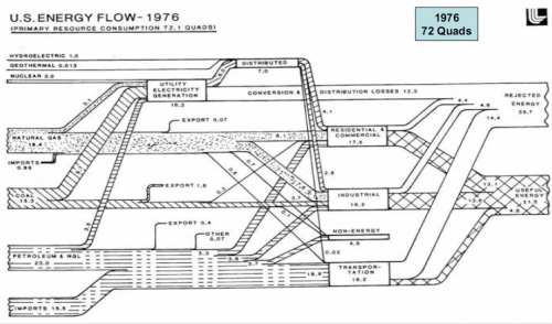
In the US, the home of the Sankey diagram is Lawrence Livermore National Lab. It has been producing Sankey diagrams for the US for over 50 years. Here’s one from 1976:
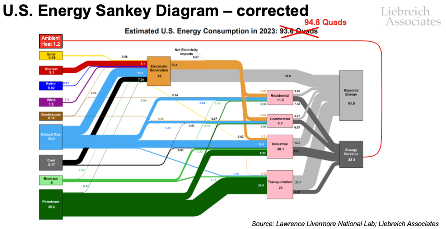
But every Sankey diagram you’ve ever seen is missing one particular energy flow. It’s a flow that was trivial when Sankey diagrams were first produced, but which now accounts for around 4% of all Energy Services consumed by the U.S. economy, and growing: ambient heat.
When Sankey diagrams were first drawn, heat pumps were no more than a novelty. The concept of the heat pump was first described by William Thomson (Lord Kelvin) in 1852, and the first working heater based on the idea was built by Austrian Peter von Rittinger between 1855 and 1857. But they didn’t catch on. A few were built before WWII, and a few more after, but it was only after the oil crisis of the 1970s that they started to be sold commercially.
Volumes remained tiny, so omitting their impact on the overall flow of energy in the economy was an understandable oversight with no consequences. But that is no longer the case.
How big is the omission?
According to the IEA, heat pumps already meet around 10% of global space heating needs, and the proportion is growing annually. Which means the ambient heat they are capturing, upgrading and delivering as Useful Energy is no longer-trivial, and we need to start including ambient heat in Sankey diagrams.
To get a sense of the scale of the omission, let’s look at the U.S.
It’s hard to find good statistics on the installed base of heat pumps in the U.S. and their output (translation: I couldn’t find any and neither could Perplexity or ChatGPT), so I came up with my own estimate:
According to the IEA, 26GW of heat pumps installed in the U.S. in 2023.
That would suggest a total fleet of around 350GW (assuming annual installations equivalent to around 1/15th of the installed base).
Assume that on average they run 20% of the time, and that would suggest they are delivering around 600TWh of heat per year or 2.1 Quadrillion BTUs (Quads, the currency of the LLNL Sankey diagrams).
To check if the 2.1 Quad figures feels right, the US uses around 9.7 Quads of space heating each year (7.6 Quads of residential and 2.1 Quads of commercial) plus another 8 Quads of industrial heat and steam at below 200C. So let’s go with it.
Assume a conservative average Coefficient of Performance of 2.5, and you get a figure of 1.2 Quads per year for the ambient heat captured and upgraded by heat pumps each year and delivered as Useful Energy into the U.S. economy.
Putting the figure in perspective
Is 1.2 Quads a lot? First of all, it means that total Useful Energy in the U.S. in 2023 was not the 93.6 Quads described in the LLNL Sankey diagram for that year, but 94.8, a difference of 1.3%. So not huge.
But wait, it all goes directly into Energy Services, with no more losses. Energy Services are not 32.1 Quads, as claimed by LLNL, but 33.3 Quads, so the Sankey diagram we are all using is missing nearly 4% of Energy Services.
Similarly, if you compared it to the 8.17 Quads of Primary Energy from coal, and ambient heat is equivalent to 14.5%. But if you compare it to the Useful Energy delivered from coal, which is 2/3 smaller than its contribution to Primary Energy, and suddenly you are missing a flow of energy equivalent to 44% of coal’s contribution to the economy!
In fact, in 2023, the missing flow of ambient heat delivered more Energy Services than solar and hydro power (0.89 Quads and 0.82 Quads). That’s wild, right?
Wait? What? This is all BS!
Now, at this point, some of you are no doubt starting to create counter-arguments. Surely somethings as obvious as this can’t have been missed?
Traditionally, ambient heat doesn’t appear on the Sankey diagram is because it is not considered a form of Primary Energy. But why not? Geothermal energy is. Solar energy is. Wind energy is. Why not energy from the air, or from a river, shallow borehole or ground source pipe array?
Is it because you can’t gather it up and sell it in the form it is found, without being upgraded? So what: oil can’t be used without being upgraded into a fuel. Solar power has to be upgraded from photons to electrons, and so on. Is it because ambient heat cannot perform work? That’s surely irrelevant: since the Energy Services used by the economy include heat, surely we should be counting all the sources of that heat.
A Quad is not a Quad
In fact, underlying this whole issue is a second problem with Sankey diagrams, this time not the fault of their originators, but with the whole concept of relying on Quads to make decisions about our energy system.
Energy has quality as well as quantity. A Quad of electricity is worth more than a Quad of fuel, which is worth more than Quad of high-temperature heat, which is worth more than a Quad of low-temperature heat - and all of them are worth more than a Quad of ambient heat.
Until, of course, we upgrade that ambient heat with a bit of electricity at the point of use to create something extremely valuable - clean heat. Because energy also has location, reliability and environmental attributes.
A big part of the energy transition is about matching types of energy to Energy Services. It makes no sense to burn natural gas at a flame temperature of 1,950°C in order to heat your house to 19.5°C. It makes no sense to use electricity - pure work - to make fuel, and then burn that fuel to power a service that could have been delivered by electricity.
It makes no sense to form your opinion of diffferent energy sources because they account for more Quads at the front end of the funnel.
And it makes no sense to pretend that ambient energy is not providing Energy Services, when it is keeping me warm as I write this.
Selah.
Coda I: This post has spurred a great discussion, thanks all. One point in particular I want to clarify. No, the heat flows from air conditioning do NOT need to be treated in the same way - they do not constitute an Energy Service.
Sankey diagrams do not include every flow of energy involving any man-made asset. The solar power that falls on a solar thermal collector is included, the solar power that falls on your car roof and heats it to the same temperature is not. Why? One is providing an energy service, the other is not.
The ambient heat that goes into a heat pump ends up - combined with most of the energy content of the electricity - as an energy service: heating. The ambient heat that seeps into your house and has to be removed by air conditioning is clearly not an Energy Service: it’s a problem that has to be solved.
I’m not making a false distinction. I’m being very precise. And I’m doing something else. I’m trying to get everyone to stop thinking about the energy system as being “stuff we do with fuel”, and switch to “how we meet society’s needs”. Whether it’s correcting the omission of ambient heat from Sankey diagrams, confronting the Primary Energy Fallacy, or using the hydrogen ladder to ask where all this hydrogen is meant to be used, this shifting of focus from inputs to societal needs runs through all my work. Even Project Bo, the solar and battery system I helped build for a neonatal unit in Sierra Leone, was driven by the same thinking: not “how do we use solar power” but how do we help an extraordinary medical team keep babies alive”.
Coda II: Thanks to those who have pointed out examples of Sankey diagrams that do indeed include ambient heat. You are pioneers, I salute you and hope that your methodologies become the standard.
Coda III: You know what else is missing from the Sankey diagrams? The energy flows associated with active transport. If anyone knows how many Quads of energy we use walking or cycling, please add them in the comments. Or produce another corrected LLNL Sankey, because it would certainly be worth making the point: fossil fuels provides a lot smaller percentage of Useful Energy than we are being told!
This is a useful insight -- that just as primary energy may be wasted to the environment in the process of performing work, so can low-grade energy from the environment be upgraded by performing work on it.
A related issue with the typical Sankey diagram is from the "equivalence of work and heat," which is probably from the second lecture in Engineering thermodynamics. But as you point out, work and heat are not truly equivalent, and there are costs --both marginal commodity costs and capital costs -- to make them equivalent.
The intersection of work and heat is therefore a very fruitful area for reducing GHG emissions, and indeed is why hybridization of stored heat with engines has been my focus.
Should ambient heat used in air conditioning systems to provide “cooling” services be counted too then?